
When creating colorful interior design styles, starting with a neutral backdrop may not be your first thought, but an accented neutral color scheme allows you to experiment and play with bolder, brighter, eye-catching accent colors and textiles.
Whether you're looking to liven up your living room, turn your kitchen from drab to fab, or strategize a full-home transformation, starting with a neutral color scheme can fit your specific style needs.
What is an Accented Neutral Color Scheme in Interior Design?
Before you click purchase on that funky pillow or dip your paintbrush in aerospace orange, it's essential in an accented neutral color scheme design to consider your neutrals first, as they are the canvas and quite literally set the tone for your space.
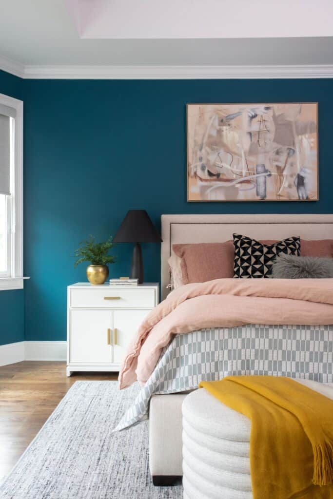
Notice how white, gray, and cream are utilized in this bedroom to help the bolder colors really pop.
In the context of interior design, any color that has been muted or desaturated is considered a neutral color. Beige, white, brown, gray, black, and taupe are the common neutrals used, but even colors such as orange, red, and purple can be considered neutral in the right shade.
Whether utilizing neutrals for your backdrop or layering neutrals throughout your space, varying shades enable you to create a neutral color palette that matches your aesthetic needs and allows bright colors, textiles, and patterns to pop.
The Spruce explains, "Accent colors can exist in the form of wall colors but also in the form of accessories such as throw pillows or artwork and furniture. They can be carried through furniture pieces and decor items, as well as an accent wall, to establish a continuous theme and harmonious aesthetic throughout a room."
Accents can also come in the form of designs and textures like patterned wallpaper or a curvy ribbed vase that breaks up the lines in a space.
Accented neutral color schemes in design are versatile, but the neutral and accent colors must be compatible for this approach to work. As with any color, neutrals can be warm- or cool-toned, or near-neutral, which are colors like off-white or gray, where tone can be harder to identify.
“Working with neutrals can be tricky,” Principal Designer Heather Zamonis Eason cautions. “You must consider the undertone in your home’s hard finishes as well as in your furniture and paint color. Selecting the wrong neutral base is a common mistake and sometimes hard to pinpoint when redesigning a space.”
Benefits of Neutral Color Scheme Interior Design
Neutral color schemes are utilized in nearly every interior design style, and many colorful interior design styles employ this strategy.
First and foremost, neutral color schemes allow you to get creative with your accessories and decor. Kim Kardashian's "cream house" in Calabasas, CA, is the perfect example of creating a blank canvas and layering neutrals throughout the home.
While Kim's house is minimalist beige with few pops of color, you can see the potential for accent colors to transform the space and bring it to life, if only for a season.
Neutral color schemes also affect the feel of the room and can reshape your space.
"The use of brighter neutrals can give your room a more open, clean, and breezy look. Muted or darker neutrals can give a space a cozier yet streamlined appearance. And if you want to sell your home, neutrals are appealing because they're calming and fresh, and they let buyers see the potential of a room," says The Spruce.
Neutral colors can be timeless and give you the flexibility to change your space as needed.
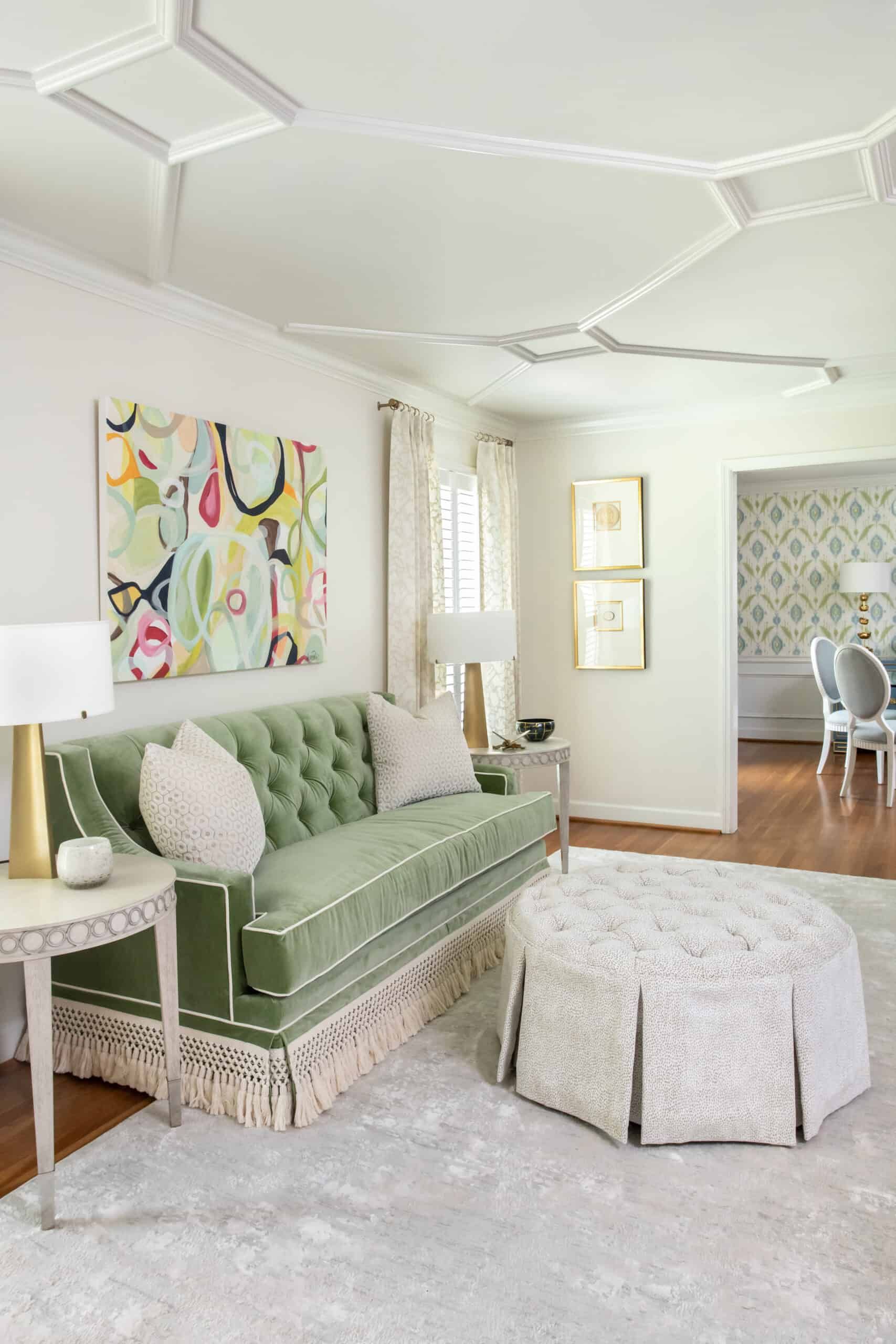
Colors and patterns in the Project Chastain living room look clean and tasteful with the help of bright, white neutrals.
Accented Neutral Color Scheme Examples
Accented neutral color schemes sound good, but what do they actually look like? Many Georgia interior designers, like Z & Co. Design Group, have embraced this look and provide inspiration for how and when to accent a neutral space.
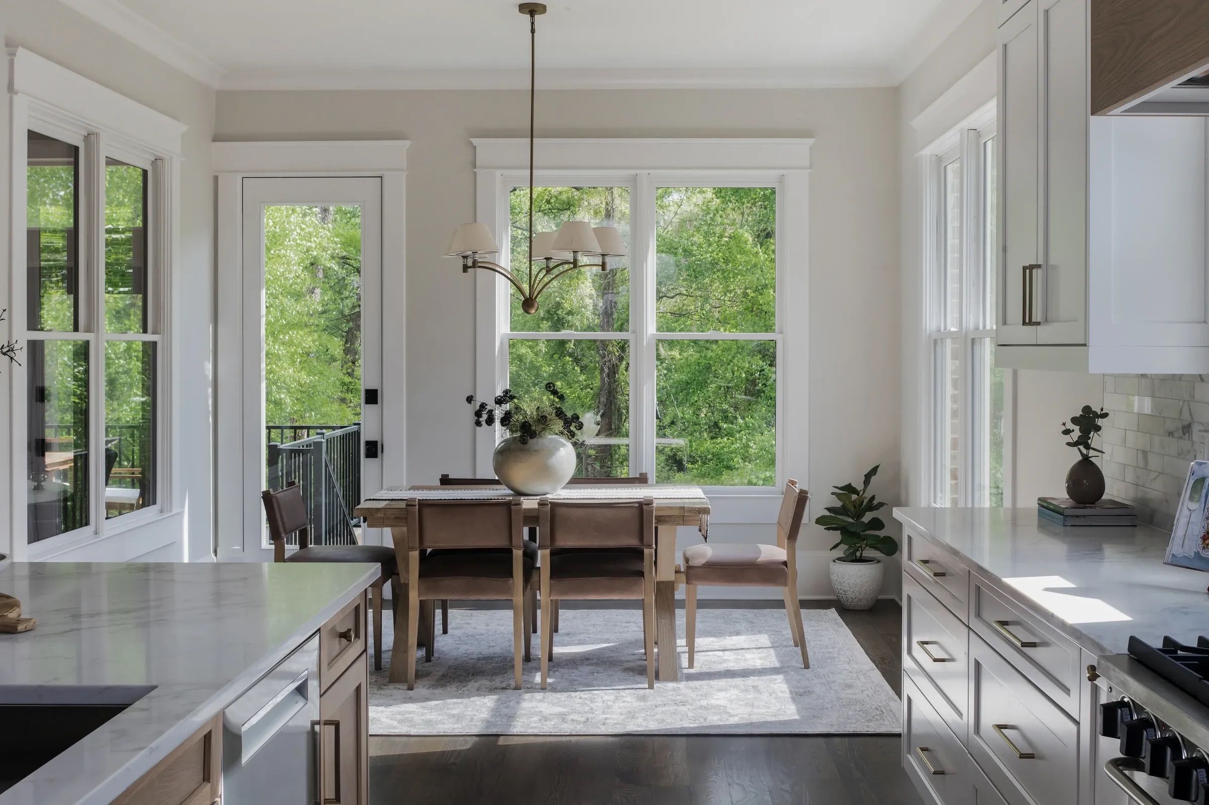
For instance, you can see how accent colors and textiles don't have to be limited to accessories in the kitchen of our North Georgia Rebuild in Cumming, GA, where the color pops on the blue island, and the distressed backsplash adds dimension to the space.
Neutral color interior design can also help transform a space that may otherwise feel quite busy. Notice how the accent wall in this Modern Office was painted a dark neutral color, so it could be layered with a vibrant picture and colorful accents without overwhelming the eye.
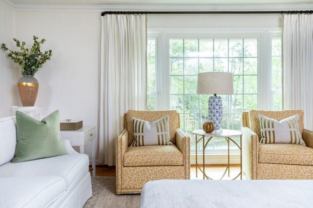
And for something more simple and interchangeable, consider how the gold accessories and orange in the carpet add warmth to the Brookhaven Reno.
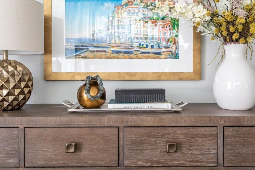
The Brookhaven Reno project by Z & Co. Design Group shows how bright colors and rich accessories pop against a neutral backdrop.
Want to Learn More About Accenting Your Neutral Color Scheme?
Creating a space that is uniquely yours and uniquely you starts with an idea. Whether you're drawn to Mid-Century Modern, French Country, or Asian Zen, or you have your own distinctive style, there are many details and possibilities to consider.
If you want to explore more ideas for making your space pop, contact us for a consultation, and let's discuss how we can create something to fit your specific style needs.
Z & Co. Design Group is an award-winning Interior Design and building resource firm, created in 2011 by Heather Zamonis Eason, located in North Atlanta, Georgia. We provide interior design & renovation services in Georgia and throughout the United States.
.jpg)